
Wellness Brand Website Redesign
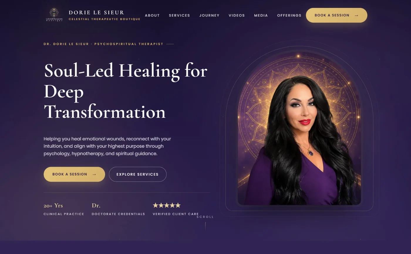
A full homepage redesign built for a real freelance job posting coded and published as a working demo instead of a static pitch deck.
What the Client Needed
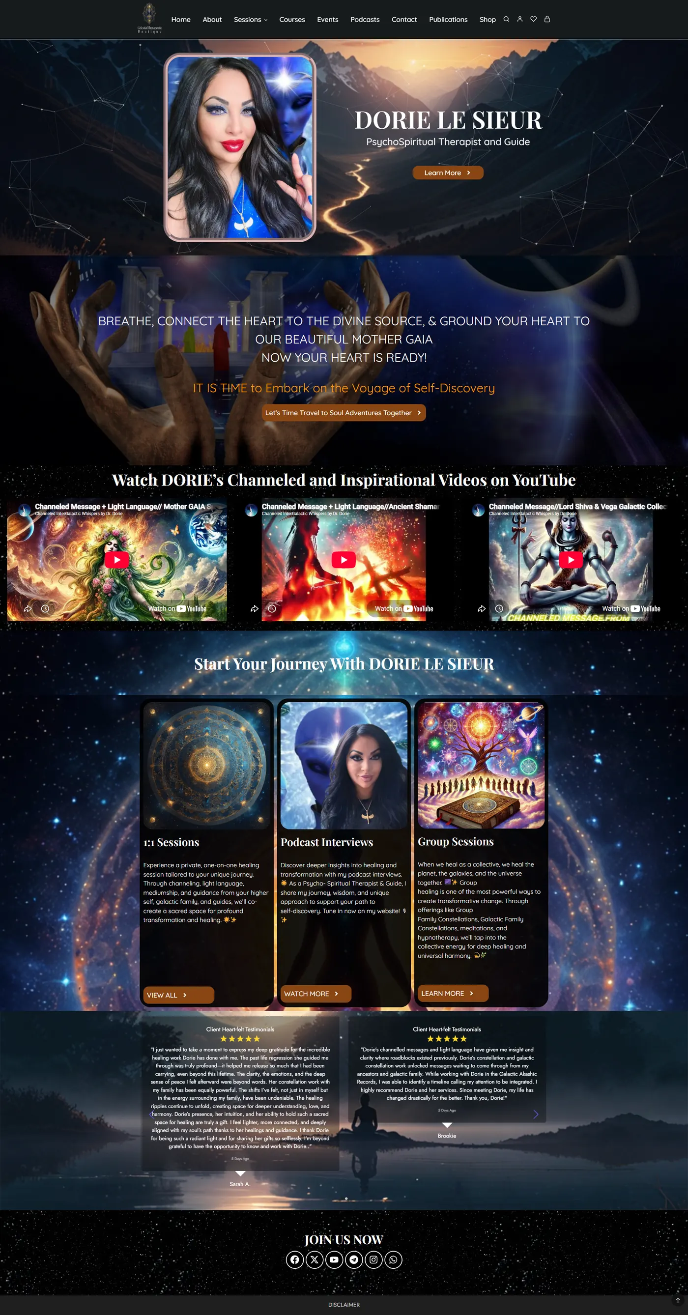
The brief looked simple on paper but was trickier in practice. The client's existing site already had a lot going on one-on-one sessions, group programs, hypnotherapy, a YouTube channel, a podcast, testimonials — but none of it felt like it belonged to the same brand. Pages were inconsistent, the visual style was scattered, and it was hard to tell at a glance what the site was even offering. She wanted something that felt more polished, more premium, and more spiritually aligned, without losing any of that existing content.
How I Approached It
Instead of sending over a moodboard or a couple of static comps, I built a full homepage and published it live, so it could be reviewed the way an actual visitor would experience it scrolling, clicking, on a real screen. I kept the celestial visual language the brand had already leaned into, but gave it room to breathe: a clearer hierarchy, a warmer gold-on-indigo palette, and consistent spacing between sections that previously felt crowded.
The bigger job was structure. I reorganized the page around a simple story — who she is, how the healing work is done, and how someone actually books a session and let the videos, podcast, and testimonials support that story instead of competing with it for attention.
What Was Designed
Technology Stack
Project Gallery
Click any image to preview it larger.

What Came Out of It
Need a Similar Website?
Let's build a fast, modern, and business-focused website for your brand.