
Travel Needs — Landing Page Redesign
A single, high-impact landing page concept for an Australian travel gear store built for a real freelance job posting and published as a live demo instead of a static mock-up.
What the Client Needed
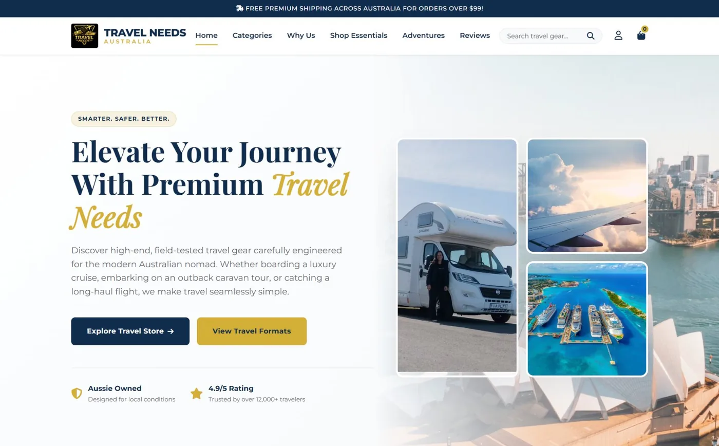
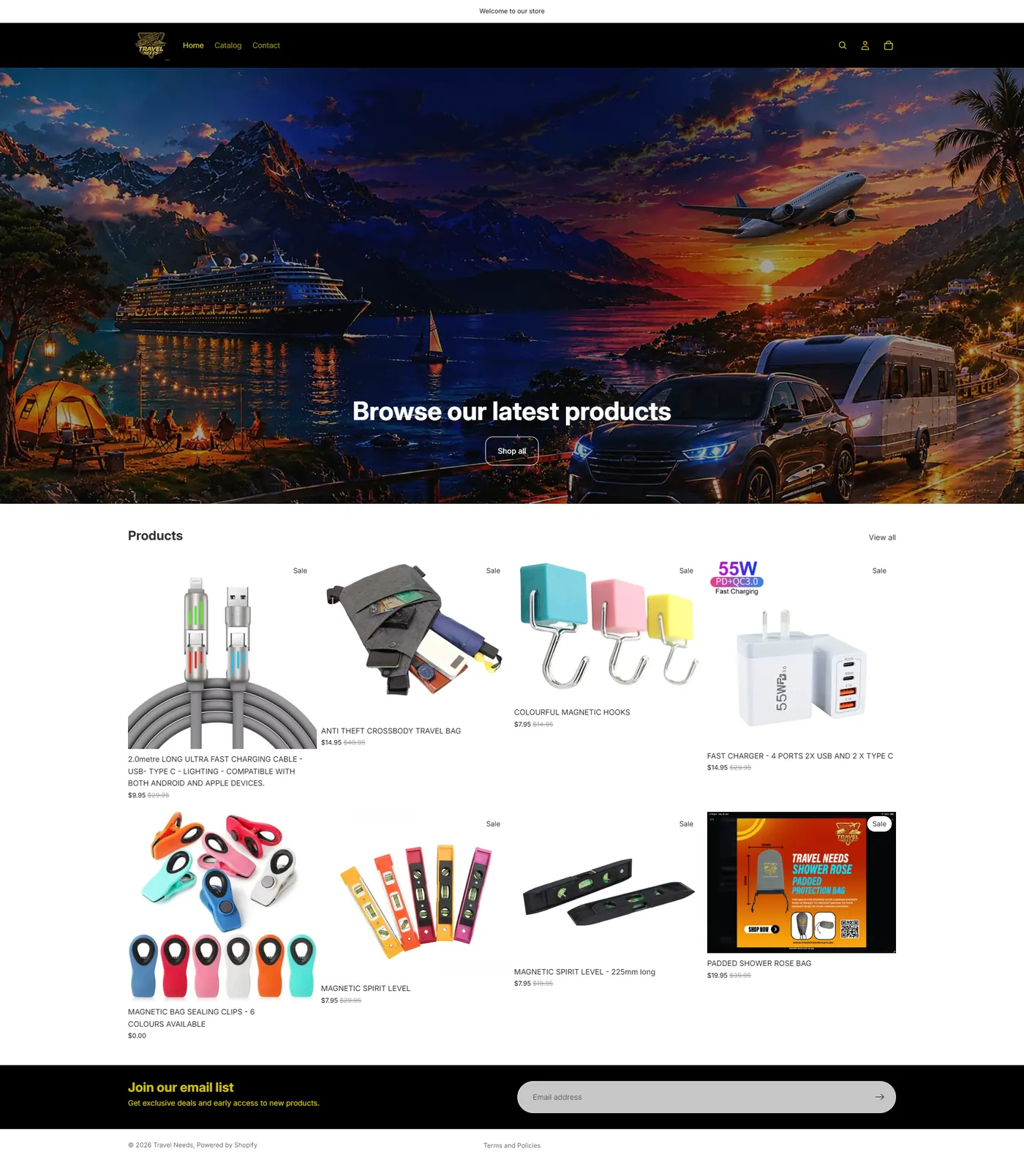
Travel Needs sells travel gear magnetic hooks, packing cubes, security wallets, cable organizers built for three specific situations: cruising, flying, and caravan or motorhome trips around Australia. Their existing store was running on a generic Shopify theme with a busy, AI-generated hero banner that didn't say anything about who they were or why their gear was different. The brief was simple to state and harder to pull off: one landing page that instantly tells a visitor who they are, what they sell, and why it makes travel easier modern and sleek, but still classy and a little fun.
How I Approached It
Instead of one generic hero banner trying to cover everything, I structured the whole page around the three ways their customers actually travel cruise, air, and caravan/motorhome and let that become the spine of the layout, from the hero photography down to how the product grid is filtered. Real lifestyle photography replaced the AI-generated artwork, and trust signals Aussie owned, a 4.9-star rating sit high on the page where a first-time visitor is still deciding whether to keep reading.
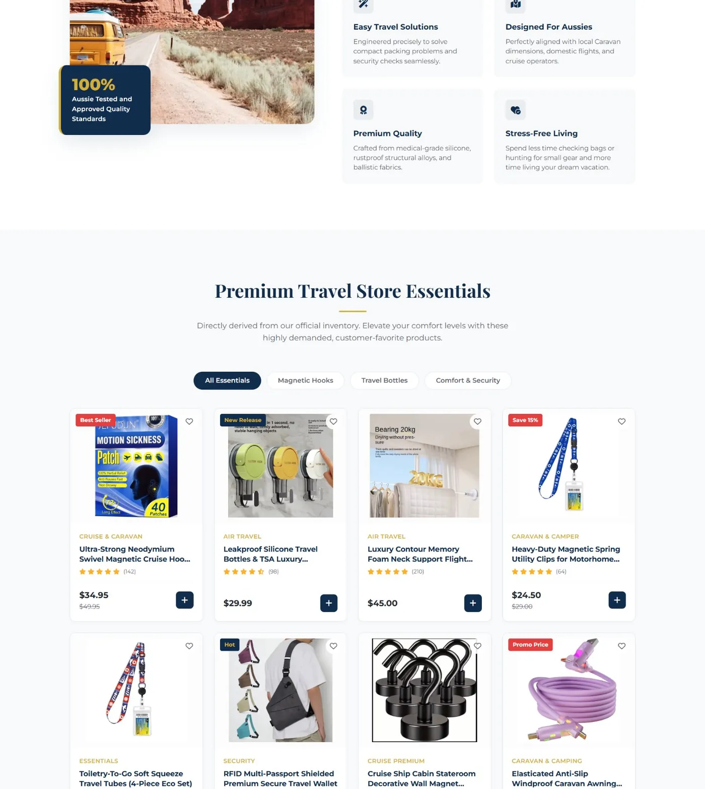
Below the fold, the page walks through why the products are built the way they are, a filterable "Premium Travel Store Essentials" grid that mirrors their real catalog structure, a short social-proof section, and a clear email-capture close with an incentive. A deep navy and gold palette was chosen to feel more premium than a typical gear-store template, without losing the fun, adventure-ready tone the brand is going for.
What Was Designed
Technology Stack
Project Gallery
Click any image to preview it larger.
What Came Out of It
Need a Similar Website?
Tell me about your product or service and I'll design something built to convert.