
GO Big Graphics
A bold, single-page concept for a wide-format printing company — built for a real freelance job posting and published as a live scrolling demo instead of a static mock-up.
What the Client Needed
GO Big Graphics is a large-format printing company building wraps, billboards, event graphics, and murals at a scale most agencies don't touch. The client wanted a single-page site that scrolled smoothly through five sections (Home, Solutions, Equipment, Contact, About) and felt as complete as a full multi-page site, but with none of the usual clicking around. The brief was explicit about tone: nothing that read as generic or AI-templated, brighter colors than the industry default, and a visual hook built around oversized animals to communicate scale with Gigantia.es named as the direct benchmark for structure and confidence. High-fidelity delivery in Figma, XD, or PSD was requested, desktop-first with mobile as a bonus.
How I Approached It
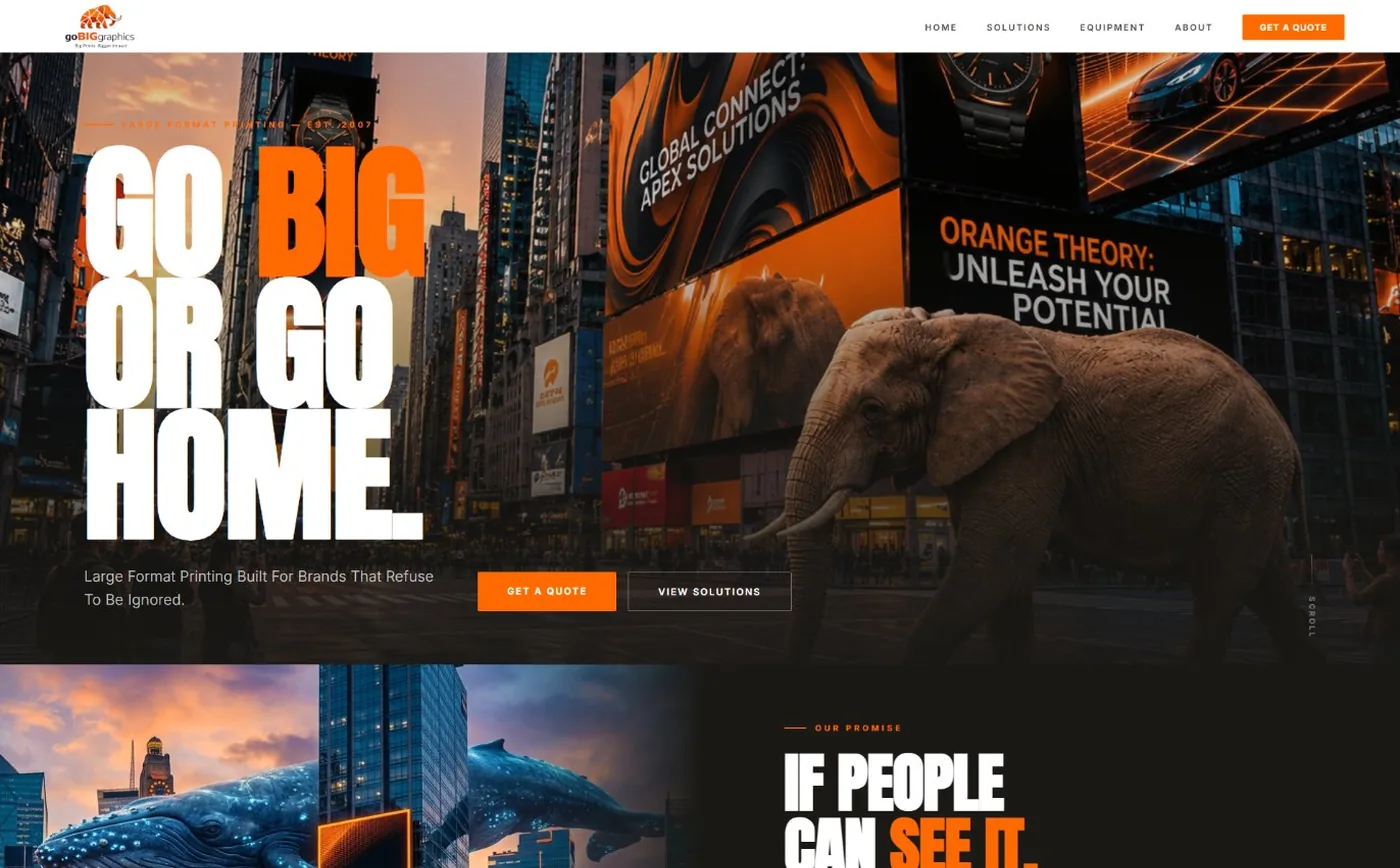
Rather than hand over static Figma frames, I built the concept as a real, scrolling one-page site and published it live the same approach I've taken on other pitches, because it's a lot easier to judge "does this feel big" by actually scrolling through it than by looking at flat panels. The hero leans hard into the brief's core idea: an oversized elephant sitting across a city street next to massive out-of-home ads, with "GO BIG OR GO HOME" in stacked, oversized type over it.
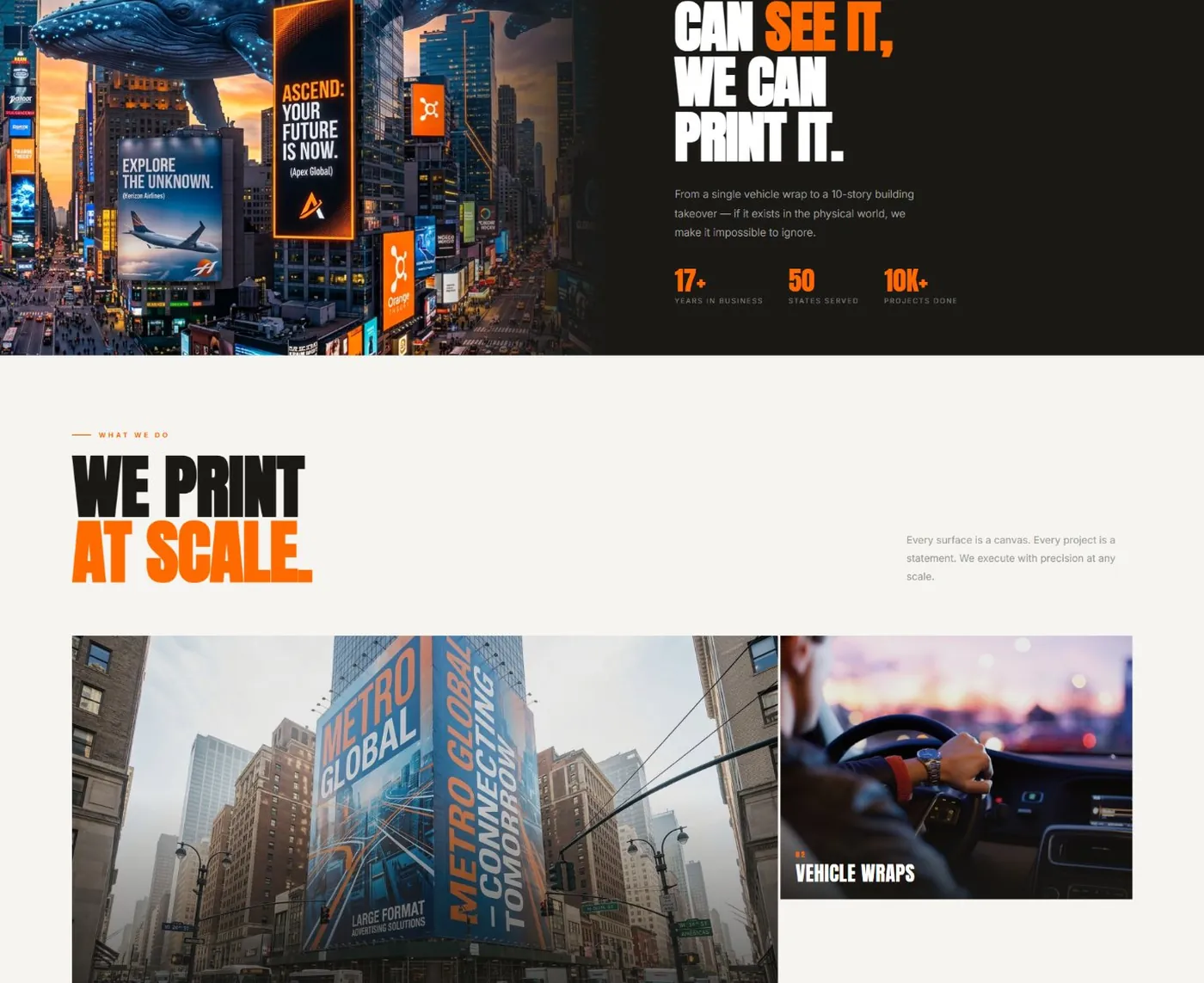
From there the page moves through capability sections (building wraps, vehicle wraps, event graphics, wall murals, outdoor signage, retail displays), an equipment showcase for their large-format printers, a stats band, an "outcomes not output" section pairing real-world photography with short, confident copy, and a workshop/about section before the contact block. Orange-on-near-black carries the brand's own energy through every section without it turning into a wall of stock photography.
What Was Designed
Technology Stack
Project Gallery
Click any image to preview it larger.

What Came Out of It
Need a Similar Website?
Let's build a fast, modern, and bold website for your brand.